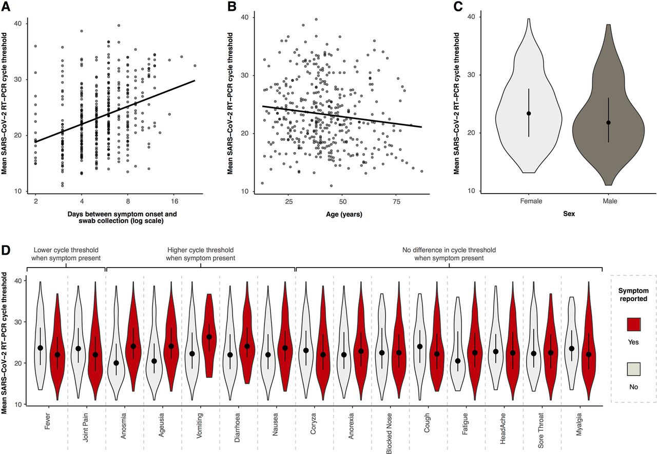
Figure 4
Relationship between mean reverse transcriptase (RT)-PCR cycle threshold (Ct) and day of illness course when the nasopharyngeal swab was collected (A), patient age (B), patient sex (C) and different symptoms at presentation (D). Panels A and B show the best-fit linear regression lines, panels C and D are violin plots (rotated kernel density plots showing the full distribution of data) of the Ct values with median (black dot) and IQR (black line).