Article Text

Abstract
Objective To explore patterns of health service use in the lead-up to, and following, admission for a ‘preventable’ hospitalisation.
Setting 266 950 participants in the 45 and Up Study, New South Wales (NSW) Australia
Methods Linked data on hospital admissions, general practitioner (GP) visits and other health events were used to create visual representations of health service use. For each participant, health events were plotted against time, with different events juxtaposed using different markers and panels of data. Various visualisations were explored by patient characteristics, and compared with a cohort of non-admitted participants matched on sociodemographic and health characteristics. Health events were displayed over calendar year and in the 90 days surrounding first preventable hospitalisation.
Results The visualisations revealed patterns of clustering of GP consultations in the lead-up to, and following, preventable hospitalisation, with 14% of patients having a consultation on the day of admission and 27% in the prior week. There was a clustering of deaths and other hospitalisations following discharge, particularly for patients with a long length of stay, suggesting patients may have been in a state of health deterioration. Specialist consultations were primarily clustered during the period of hospitalisation. Rates of all health events were higher in patients admitted for a preventable hospitalisation than the matched non-admitted cohort.
Conclusions We did not find evidence of limited use of primary care services in the lead-up to a preventable hospitalisation, rather people with preventable hospitalisations tended to have high levels of engagement with multiple elements of the healthcare system. As such, preventable hospitalisations might be better used as a tool for identifying sicker patients for managed care programmes. Visualising longitudinal health data was found to be a powerful strategy for uncovering patterns of health service use, and such visualisations have potential to be more widely adopted in health services research.
- Preventable hospitalisations
- data visualisations
- longitudinal health data
- PRIMARY CARE
This is an Open Access article distributed in accordance with the Creative Commons Attribution Non Commercial (CC BY-NC 4.0) license, which permits others to distribute, remix, adapt, build upon this work non-commercially, and license their derivative works on different terms, provided the original work is properly cited and the use is non-commercial. See: http://creativecommons.org/licenses/by-nc/4.0/
Statistics from Altmetric.com
Strengths and limitations of this study
This is the first study to explore the temporal pattern of health events and health service use around preventable hospitalisations using large population-level data.
Novel data visualisations allowed for efficient identification of health events before, during, and following preventable hospitalisation, as well as population-level patterns of health service use.
The visualisations are descriptive are not adjusted for patient factors such as age, sex and health status.
The findings may not be generalisable to other healthcare systems, but the visualisations offer a novel approach that can be adopted for comparative research.
Introduction
Preventable hospitalisations have been adopted internationally as an indicator of timely and effective access to primary care services. Originally conceived in the late 1980s,1 preventable hospitalisations, also known as ambulatory care sensitive or avoidable hospital admissions, comprise admissions for a set of diagnosis codes which are considered to be potentially preventable if the patient had access to quality primary care services. Intuitively appealing, these hospitalisations are reported by governments for performance measurement of the primary care system,2 ,3 and are used commonly in research as a health outcome measure. However, there has been surprisingly little research exploring the actual use of primary healthcare services around the time of hospitalisation, which requires linkage of primary care and hospital data for individuals.
As data on primary care are not always routinely collected, much of the research on preventable hospitalisations has been ecological, comparing population-based rates of hospitalisation to proxy measures of access, such as the supply of general practitioner (GP) services in an area,4–7 the average number of available hospital beds,8 ,9 socioeconomic characteristics of the population10 or perceived access to care.11 ,12 However, aggregated approaches may be subject to an ecological fallacy,13 and there is a view that access can be more meaningfully explored through patient behaviour, or ‘realised’ access to care relative to need, rather than barriers that predispose or enable patients' access to services.14
The few studies with linked, person-level data on health service use have investigated the impact of provider continuity15 ,16 or the number of primary care consultations17 ,18 on rates of hospitalisation, broadly finding that people with more GP visits or with more visits to the regular provider of care had lower rates of preventable hospitalisation (with the exception of very high use patients). However, patients' use of primary care services differs greatly across countries and healthcare systems,19 and can be confounded by the disposition and need of a patient to use the services,20 and there is growing debate on exactly what role GPs can take in further reducing rates of preventable hospitalisation.4 ,21–24 Notably, there has been no exploration of the temporal pattern of primary care in the lead-up to a preventable hospitalisation, which is important, given many of these admissions are assumed to be avoidable if a person suffering an acute exacerbation could obtain care in a primary care setting.
Data visualisations are a promising method for exploring patterns of health events. Widely considered to be a powerful technique for investigating and identifying underlying patterns in ‘big data’,25 a number of visualisation tools have been developed for longitudinal health data, typically presenting a visual timeline of health events for one or more patients over time.26–31 While there are a number of variations on this technique, such as centring patients' time on specific health events,32 grouping patients with similar health trajectories,30 ,31 or as a dashboard displaying various clinical characteristics,29 ,33 these tools have not been widely used within health services research. This may be because the relevant software tools were developed to aid patient monitoring, clinical decision-making and interactive data interrogation, and so have limited capabilities for the varied and complex needs of researchers.34 ,35 An exploration of preventable hospitalisations, for example, would require combining different types of events (eg, single-day GP visits, multiple-day hospital admissions) for large population-based cohorts, while adhering to ethical standards in maintaining the privacy of individual patients.36 While no such visualisation tool currently exists, there is unfulfilled potential to create simple visualisations using more general visual analytic tools.
This study sought to explore the temporal pattern of health service use around preventable hospitalisations for participants in a large cohort of older adults in New South Wales (NSW) Australia, using a novel data visualisation of trajectories of individual patient health service use.
Methods
Data sources
Linked health data were used within the Assessing Preventable Hospitalisation InDicators (APHID) study, details of which have been published elsewhere.37 Briefly, APHID includes participants from the Sax Institute's 45 and Up Study,38 a prospective cohort of 266 950 men and women aged over 45 in NSW, Australia. Study participants were recruited from 2006 to 2009 through the Department of Human Services' Medicare system (Australia's national universal health insurer). At study, entry participants completed a detailed questionnaire on their sociodemographic and health characteristics, and provided signed consent for long-term follow-up, including linkage to administrative health data sets.
For each study participant, linked data were obtained from a number of data sources. Hospitalisations were obtained from the NSW Admitted Patient Data Collection (APDC), a census of all hospital separations (discharges, transfers and deaths) from all NSW public and private sector hospitals and day procedure centres, with linked data available from 2000 to 2013. Emergency department (ED) data were obtained from the NSW Emergency Department Data Collection (EDDC), which contains information on presentations to 80 EDs in NSW, capturing around 75% of all presentations to NSW EDs, with linked data from 2006 to 2013. Medicare-funded claims for GP and specialist medical practitioner consultations were obtained from the Medical Benefits Schedule (MBS), the country's universal health insurance scheme for subsidised medical care, with linked data from 2005 to 2011. Fact of death data were obtained from the NSW Registry of Births, Deaths and Marriages (RBDM) mortality data file, with linked data from 2006 to 2013.
Probabilistic data linkage of the APDC, EDDC and the RBDM mortality data was performed by the NSW Centre for Health Record Linkage (http://www.cherel.org.au/) using ChoiceMaker software; a manual clerical review on a sample of linkage records found a false positive linkage rate of 0.3%. Linkage of Medicare data was performed deterministically by the Sax Institute using a unique person identifier. Ethics approval for the 45 and Up Study was granted by the University of New South Wales Human Research Ethics Committee, and approval for the APHID study was granted by the NSW Population and Health Services Research, Aboriginal Health and Medical Research Council and University of Western Sydney Research Ethics Committees.
Health events and health service use
Preventable hospitalisations were identified in the hospitalisation data according to the indicator used in the Australian 2012 National Healthcare Agreement. This comprises admissions for 21 different conditions broadly categorised as ‘chronic’, ‘acute’ and ‘vaccine-preventable’, and includes conditions such as diabetes complications, angina, asthma and influenza (see online supplementary file 1).39
Supplementary file
A range of other types of health events were identified in the linked health data, including claims for GP or specialist medical practitioner services from the MBS data, all presentations to an ED from the EDDC data, all other hospitalisations from the APDC data and all deaths from the RBDM mortality data file. The criteria for identifying each type of event are provided in online supplementary file 1.
All preventable hospitalisations for study participants were identified during a snapshot time window, 1 January to 31 December 2010, for which linked data from all data sources were available. To explore events surrounding preventable hospitalisations, records for GP consultations, ED presentations, all other hospitalisations, specialist consultations and deaths were extracted for an extended period around this time window, 1 July 2009–30 June 2011.
Visualising longitudinal health data
The visualisations presented unit record data using static timelines,28 with each row on the y-axis representing a person and each point on the x-axis representing a point in time. Single date events, such as a health consultation, disease notification or death, were represented by a point or symbol at that moment in time. Interval events, such as a hospital stay, were represented by a line indicating the length of the event.
To bring structure to the figures so that patterns were easier to identify, each type of health event was plotted using a different colour and on a separate vertical panel. Patients on the y-axis were sorted according to features of their preventable hospitalisations, including whether they were admitted or not, the number of hospitalisations, date of first hospitalisation and length of hospital stay, as well as their personal characteristics, such as remoteness of area of residence or self-rated health. Time on the x-axis was displayed either centred on the date of first admission or spread over the calendar year. A variety of plots were produced, varying the time scale (calendar time, 90-day period surrounding first admission), or the order in which participants were displayed. The plots were interpreted by looking for visual patterns in the position, density or clustering of the health events.
In order to compare patterns of health events to the general population, relative to the need and disposition to use health services, a propensity-matched subcohort of participants who had not been admitted for a preventable hospitalisation was also identified. This cohort was matched to the admitted cohort on a range of sociodemographic (eg, age, sex, geographic remoteness of residence,40 income, education) and health (eg, body mass index (BMI), self-rated health, multimorbidities, functional limitations) characteristics using a ‘greedy’ matching algorithm.41
All data manipulation was performed in SAS V.9.3, while all figures were produced in Stata V.12.0. An example of data structure and Stata syntax for producing a plot are provided in online supplementary file 2.
Supplementary file
Results
Of the 266 950 study participants, 1.7% (n=4717) died prior to 2010, leaving 262 233 participants for analysis. Of these, 8715 were admitted for a preventable hospitalisation in 2010, of whom 78% were admitted for a preventable hospitalisation once, 16% were admitted twice, 3% were admitted thrice and 3% were admitted four or more times. 63% of preventable hospitalisations were for chronic, 35% for acute and 2% for vaccine-preventable conditions, with patients admitted for chronic conditions tending to have on average more hospitalisations per person (see online supplementary file 3).
Supplementary file
Figure 1 presents a plot of health events for all persons admitted for a preventable hospitalisation in 2010, with time centred on the 90 days before and after the first date of admission. Patients are sorted by their total number of preventable hospitalisations and length of stay, so that the preventable hospitalisations form a ‘funnel’ shape. At the time of admission, there is a clear corresponding ‘shadow’ of GP consultations and ED presentations, indicating that many patients used these services in the lead-up to admission. Subsequent descriptive statistics (table 1) found that 14.5% of patients had a GP consultation on the day of admission, with 27.4% of patients having at least one further GP consultation in the week leading up to the day of admission and 64.8% in the prior month. Almost half (48.9%) of patients had presented to an ED on the day of admission.
Health events in the 3 months preceding and following first preventable hospitalisation

Health events in the 90 days leading up to, and following, first preventable hospitalisation, with patients sorted by their number of preventable hospitalisations in 2010 and length of hospital stay. ED, emergency department; GP, general practitioner.
There was a similar ‘shadow’ indicating increased levels of GP visits, other hospitalisations and deaths in the period immediately following discharge, particularly for patients with a longer length of stay (figure 1). Rates of death in the broader period following discharge similarly appeared to increase for patients with a longer length of stay.
Specialist medical practitioner consultations appeared to be largely provided during the period of hospitalisation (figure 1), although 12.5% of patients had a specialist consultation in the week prior, and 37.9% in the month prior to hospitalisation (table 1). In total, 30.4% and 75.3% of patients used either GP or specialist services in the week and month prior to hospitalisation, respectively (see online supplementary file 3).
To determine if health events and service use were different among admitted patients to the general population, figure 2 plots health service over calendar year for study participants admitted for a preventable hospitalisation and the matched cohort of study participants not admitted for a preventable hospitalisation. Admitted patients were sorted by their total number of preventable hospitalisations and the date of first admission, so that preventable hospitalisations form the shape of a line. The non-admitted participants were sorted according to their corresponding match. The two cohorts were very similar across sociodemographic and health characteristics at the time of study entry (see online supplementary file 3).

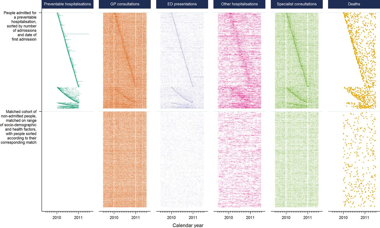
Health events in participants admitted for preventable hospitalisation in 2010, and a demographically matched cohort of non-admitted participants. ED, emergency department; GP, general practitioner.
There are visible vertical ‘gaps’ in figure 2 among claims for GP and specialist consultations over calendar years, corresponding to weekends and holiday periods (eg, Christmas, Easter), where many healthcare professionals (and patients) are on leave. As with figure 1, there is a corresponding ‘shadow’ among all health events occurring around the time of a preventable hospitalisation. Across the whole calendar year, the density of health events appears to be greater for admitted patients than their matched non-admitted peers. Subsequent descriptive statistics (table 2) found the rate of health events in the admitted patients was more than twice that of the matched non-admitted participants for all type of events except GP (around 30% higher) and specialist (around 85% higher) consultations. There was a slight increase in the density of all health events for patients with a greater number of preventable hospitalisations.
Rates of health events per person-year* for study participants admitted with a preventable hospitalisation during 2010, as well as a demographically matched cohort of study participants not admitted for a preventable hospitalisation
Additional plots are provided in online supplementary file 3, including all study participants sorted by their self-reported health status, and all admitted patients sorted by the remoteness of their area of residence. These plots show a gradient of increased levels of service use with poorer self-rated health and that many residents in regional areas, but not major cities, have GP consultations during the period of their hospitalisation.
Discussion
This study was the first to explore the temporal pattern of health events in the periods preceding and following preventable hospitalisation, and in doing so created novel visualisations of trajectories of individual patient health service use. We found that participants admitted for a preventable hospitalisation did not show evidence of limited access to primary care, rather they tended to have high levels of engagement with the healthcare system, with higher rates of health events and service use than non-admitted patients, and a clustering of other health events at the time of preventable hospitalisation.
Only a very few studies, none from Australia, have had linked data on a persons' use of primary care services and preventable hospitalisations with which to compare our results,15 ,17 ,18 ,23 but our findings are consistent with the view that preventable hospitalisations may be more reflective of gradients of health than of poor access to healthcare.4 ,23 ,24 Australia has a universal healthcare system with GPs as gatekeepers to specialist care, and use of services may be more reflective of need than in the USA, the setting for much of the previous research on preventable hospitalisations. Health-related factors have been found to be some of the strongest and most consistent drivers of preventable hospitalisation,4 ,42 and the clustering of other hospitalisations and deaths following discharge indicate many patients might be in a state of health deterioration. Indeed, participants admitted for a preventable hospitalisation had twice the number of annual GP visits (13.1 per year) compared with the Australian average (6.5)19 and around 30% more GP consultations than people from the same study population with similar socioeconomic status and health characteristics (9.8). With similarly higher rates of ED presentations and specialist consultations, this elevated pattern of realised access to services is likely to indicate greater health need beyond the factors used for propensity matching.
These findings support strategies for reducing the overall healthcare burden by targeting patients with high levels of health service use, such as through managed care programmes.43 Integrated care programmes involving coordination between healthcare providers for patients with complex needs have been found to be effective in reducing hospitalisations.44 ,45 The current findings that almost two-third of patients had visited a GP in the month leading up to admission, that many patients, especially in rural areas, had GP consultations during their hospitalisation, and that many patients had specialist visits in the lead-up to and during their hospitalisation, suggest these admissions may have been a considered part of their care. Furthermore, the clustering of health events, particularly other hospitalisations, around the time of preventable hospitalisation indicates poor specificity should the indicator be interpreted as an isolated ‘preventable’ health event. By visualising patterns of health service use, the visualisations in this study offer a useful starting point for identifying classes of high use individuals, rather than specific types of hospitalisations, for targeted policy intervention.
While claim-based measures of GP and specialist use give an indication of patients' realised access to services, they are limited in their ability to unpack further dimensions around access to, or quality of, care. For example, 14% of admitted patients had seen a GP on the same day as their preventable hospitalisation, but the current data did not allow temporal sequencing of events on the day of admission, such as referrals by a GP or admissions through an ED. Accordingly, we could not determine whether these visits were the direct antecedents of the admission, or could perhaps have been opportunities for it to be prevented through timely provision of care. Patients may face a number of barriers, such as waiting times and cost, that in Australia are often not proportional to patients' need.46 However, data on service use are an integral part of understanding patients' access to healthcare,46 and studies further integrating patient and doctor experiences and measures of health need47 will help consolidate our understanding of the true ‘preventability’ of these admissions.
The elements used here for creating the visual trajectories of individual patient health service use have been well explored within the literature. Timelines have been used to plot longitudinal health events in a number of ways, as point events or intervals, and for individual patients29 ,32 or clustered groups.30 ,31 Filtering, ordering, and aligning people and events are known to help add structure to help identify underlying patterns of the data,25 ,32 and similarly colouring, juxtaposing and superimposing different items is known to be an effective means for comparing and contrasting groups.25 However, no visualisation tool has combined these elements in a manner which allows the flexible presentation of large-scale data on patterns of health service use. This is not surprising, given the current visualisation tools are more oriented towards clinical information for patient management, and there is great diversity in the size, shape or format of the administrative data that are used for health services research.
Although a range of software platforms are available for producing custom visual analytics, the plots in this study present a simple approach to visualisation using longitudinal data that is an accessible ‘first step’ for researchers. They were created using standard statistical software, could be created in a range of other software packages, and could be used for studies exploring, for example, pathways of patient admissions, transfers and referrals; disparities in health service use; outcomes following surgery or hospitalisation; or adherence to pharmacotherapy or treatment protocols. However, one limitation is that considerable thought needs to go into the construction of the plots. Choosing the right structure, such as a juxtaposed or superimposed plots, as well as characteristics of the data items, such as point, line and symbol size, hue and luminance are important to ensure accurate visual comparisons are made. Good guidance exists to help with these choices.25 ,28 Consideration should also be made to the size of the plot, and whether the number of pixels available will be sufficient to present the quantity of information required. In this study, large amounts of information were presented in a comparably small image, allowing clear identification of overarching patterns in the data, yet protecting individual privacy because data trajectories of individual patients are almost impossible to identify. While for many researchers the benefits of a customised visualisation may be outweighed by the usability and support of off-the-shelf interactive software tools, these plots are technically feasible within a range of software packages and easier adoption in the future may come through users sharing metadata and syntax, such as in that provided in online supplementary file 2, or the adaption of software tools targeted towards more flexible displays of longitudinal health data.
A limitation of the study is that participants in the 45 and Up Study are older and potentially healthier than the general population,38 and with a low study participation rate (18%), there may be concerns about generalisability. However, persons aged 45 years and above represent a clinically meaningful population, contributing two-thirds of preventable hospitalisations in Australia, and with the highest rates of admission.48 While previous research has found internal risk estimates from the 45 and Up Study to be comparable with those from population health surveys,49 and there is sufficient heterogeneity between study participants to allow for valid within-cohort comparisons, the visualisations in this study were descriptive and largely unadjusted. However, the core strength of these visualisations is that they allow interrogation of the data not possible using standard epidemiological methods, and it is difficult to conceive a more effective method for exploring the complex pattern of health events before, during and following preventable hospitalisation.
Conclusion
This study did not find evidence that preventable hospitalisations reflected limited use of primary care services, rather admitted patients tended to have high levels of engagement with multiple elements of the healthcare system. Preventable hospitalisations in Australia may therefore be more useful as a tool for identifying sicker patients for managed care programmes, which can improve the quality, coordination and timeliness of care received, rather than as an indicator of supply of primary care. Visualising longitudinal health data was found to be a powerful strategy for uncovering patterns of health service use, and while technically possible, is underutilised within health services research. Such visualisations have potential to be more widely adopted.
Acknowledgments
The authors thank the APHID Study investigator team, which comprises Louisa Jorm, Alastair Leyland, Fiona Blyth, Robert Elliot, Kirsty Douglas, Sally Redman, Michael Falster, Bich Tran, Sanja Lujic, Deborah Randall, Marjon van der Pol, Damilola Olajide, Danielle Butler, Neville Board, Douglas Lincoln, Kim Sutherland, Chris Shipway and Nigel Lyons. This research was completed using data collected through the 45 and Up Study (http://www.saxinstitute.org.au). The 45 and Up Study is managed by the Sax Institute in collaboration with major partner Cancer Council NSW; and partners: the National Heart Foundation of Australia (NSW Division); NSW Ministry of Health; NSW Government Family & Community Services—Carers, Ageing and Disability Inclusion; and the Australian Red Cross Blood Service. The authors thank the many thousands of people participating in the 45 and Up Study. They thank the Sax Institute, the NSW Ministry of Health, NSW Register of Births, Deaths and Marriages and the Department of Human Services for allowing access to the data, and the Centre for Health Record Linkage for conducting the probabilistic linkage of records.
References
Footnotes
Contributors MOF conceived the project, performed data analysis, designed the visualisation and drafted the manuscript. LRJ and AHL provided guidance and interpretation. All three authors edited, reviewed and approved the final manuscript. LRJ conceived the APHID study.
Funding The APHID study is funded by a National Health and Medical Research Council Partnership Project Grant (#1036858) and by partner agencies the Australian Commission on Safety and Quality in Healthcare, the Agency for Clinical Innovation and the NSW Bureau of Health Information. AL receives funding from the Medical Research Council (MC_UU_12017/13) and the Scottish Government Chief Scientist Office (SPHSU13).
Competing interests None declared.
Ethics approval NSW Population and Health Services Research Ethics Committee.
Data sharing statement The data set used for this study was constructed from pre-existing source data sets (routinely collected data and the 45 and Up Study) with the permission from the custodians of each of these data sets and with specific ethical approval. The data set could potentially be made available to other researchers if they obtain the necessary approvals. Further information on this process can be obtained from the 45 and Up Study (45andUp.research@saxinstitute.org.au) and the NSW Centre for Health Record Linkage (cherel.mail@moh.health.nsw.gov.au).