Article Text

Abstract
Objective Many studies have documented higher mortality levels in the USA compared to other high-income nations. We add to this discussion by quantifying how many years behind comparison countries the USA has fallen and by identifying when US mortality rates began to diverge.
Design We use full life tables, for men and women, for 17 high-income countries including the USA. We extract the life expectancy at birth and compute the mortality rates for each 5-year age group from birth up to age 80. Using the metric of how many ‘years behind’ a country has fallen, we compare US mortality levels with those in other high-income countries (‘comparators’).
Results We report life expectancy for 17 high-income countries, for the period 1958–2007. Up to the late 1970s, US men and especially women closely tracked comparators in life expectancy. In the late 1970s in the USA, most strikingly women began to diverge from comparators so that the US female life expectancy in 2007 corresponded to that of the comparators’ average 10 years earlier. Mortality rates also began to diverge from the late 1970s, and the largest mortality gap was in the 15–49 age group, for both men and women, where the USA had fallen about 40 years behind the comparators by 2007.
Conclusions Some causes proposed for the relatively high US mortality today—racial differences, lack of universal health insurance, US exceptionalism—changed little while the mortality gap emerged and grew. This suggests that explanations for the growing gap lie elsewhere. Quantification of how many years behind the USA has fallen can help provide clues about where to look for potential causes and remedies.
- Public Health
This is an open-access article distributed under the terms of the Creative Commons Attribution Non-commercial License, which permits use, distribution, and reproduction in any medium, provided the original work is properly cited, the use is non commercial and is otherwise in compliance with the license. See: http://creativecommons.org/licenses/by-nc/3.0/ and http://creativecommons.org/licenses/by-nc/3.0/legalcode
Statistics from Altmetric.com
Article summary
Article focus
-
Many studies have documented higher mortality levels in the USA compared to other high-income nations of Europe and Australasia.
-
This study quantifies how many years behind comparison countries the USA has fallen and explores whether there was a particular time when US mortality rates began to diverge from those of the comparators.
Key messages
-
Since the late 1970s, US life expectancy, most strikingly that of women, began to diverge from that of comparators so that the US female life expectancy in 2007 corresponded to that of the comparators’ average 10 years earlier.
-
Mortality rates also began to diverge from the late 1970s, and the largest mortality gap was in the 15–49 age group, for both men and women, where by 2007 the USA had fallen about 40 years behind the comparators.
-
Identification of when US mortality rates began to diverge from those of the comparators provides clues about where to look for potential causes and remedies.
Strengths and limitations of this study
-
The study uses full life tables, for men and women, for 17 high-income countries for an extended time series. The detailed results allow for tracking the magnitude and timing of US divergence. This provides a specific criterion for assessing the explanatory power of causes proposed for poor performance, and narrows the range of potentially important determinants.
-
The study does not propose comprehensive explanations for high relative US mortality today and why the mortality gap emerged and grew, as it is instead a tool for others making those assessments. Concern for the poor US performance on mortality prompted major investigations by the US National Academy of Sciences into its causes, and it is not our purpose to reiterate the conclusions of the US National Academies’ assessments.
-
This paper adds to the National Academies’ assessments by identifying rapid changes on the path to improvement in life expectancy and a particular point in time marking the US deterioration relative to its comparators.
Introduction
Much has been said and debated about the differences in health outcomes among high-income countries. Using different measures of health, mortality and disability, many studies have documented that the population of the USA is less healthy than those of the high-income nations in Europe and Australasia. This finding of poorer US health outcomes relative to other nations plays a significant part in public debate over improving US health outcomes.1 This paper adds to the previous discussion by quantifying how many years behind its comparators the USA has fallen and by exploring whether there was a particular time when US mortality rates began to diverge from the others. Identification of such a time would provide clues about where to look for potential causes and remedies.
The metric used to assess performance must be able to capture variation across countries and over time. In this paper, we apply a long-established approach to performance measurement that lends itself readily to graphic depiction: the assessment of how many ‘years behind’ a country has fallen, relative to other countries.2 ,3 We compare the life expectancy (and age-specific mortality rates) for men and women in the USA with the best country life expectancy (‘leader’) and figures from 16 other high-income countries in the Organisation for Economic Co-operation and Development (OECD, ‘comparators’), from 1958 to 2007, using data primarily from the Human Mortality Database.4 This dynamic depiction also captures the magnitude of the effort needed to catch up with other participants. Evolution over time of years behind enables sensitive identification of divergent and convergent trends, and the ability to flag rapid changes on the path to improvement in life expectancy. This capacity underpins an important purpose of this paper, which is to identify whether there is a point in time marking the beginning of US deterioration relative to its comparators.
Design
Data
We use full life tables encompassing the years 1850 through 2007,4 for men and women, for the following 17 countries: Australia, Austria, Canada, Denmark, Finland, France, Germany (West Germany), Italy, Japan, the Netherlands, Norway, Portugal, Spain, Sweden, Switzerland, the UK and the USA. This set of countries is a subset of high-income OECD countries chosen for best comparability to the USA. The selection criteria were of sufficient population size to ensure stability of estimates, high development achieved for a long time period, data quality and availability, and were described elsewhere.5 We extract the life expectancy at birth for men and women, and the mortality rates for each 5-year age group from birth up to age 80 (0–4, 5–9, 10–14,…, 75–79), and additionally for the specific age ranges 0–14 and 15–49.
Approach
We report life expectancy at birth for men and women for all 17 countries, for the period 1958–2007. (The latest year available for the USA was 2007. The earliest available year for West Germany was 1956. We retained the years 1958–2007 in order to have five 10-year periods.) In keeping with published methodology, for each year we identify the highest recorded life expectancy, that is, the leader.1 ,6 ,7 These point estimates define a ‘maximum frontier’. We also estimate the average life expectancy recorded for the 16 countries (arithmetic average), besides the USA, that is, the comparators. Finally, we compare the US life expectancy with both the leader and the comparators. We do this by calculating how many years behind the leader the USA and the comparators fall in a given year. For instance, if in 2007 the USA had a life expectancy which was closest to the life expectancy of the leader in 1986, then the USA is said to have been 21 years behind the leader in 2007.
In order to investigate to what extent the health gap varies across different age groups, we analyse mortality rates for men and women for the age groups described above, for the period 1958–2007. Similarly, we identify the country with the lowest recorded mortality rates in a given year (leader), which defines a ‘minimum frontier,’ and we compute the comparators’ average observed mortality rates per age group. Note that this leader is not necessarily the same as the leader in life expectancy. Finally, we calculate how many years behind the USA and the comparators are for each age group and each year of the period 1958–2007.
Results
Years behind for life expectancy
Figure 1A shows the evolution of the leader, the USA and the comparators over the period 1958–2007 for male and female life expectancy. In any given year, the leader, the USA and the comparators had higher life expectancies for women than for men. The US life expectancy for men was lower than the comparators’ life expectancy for men; the differential of life expectancy between the USA and the leader diminished from the late 1950s to the late 1970s, and then stayed about the same after the late 1970s, while the differential of life expectancy between the USA and the comparators increased slightly after the late 1970s. For women, the US life expectancy was about the same as that of the comparators from the late 1950s to the late 1970s, and both converged slightly towards the leader. Notably, after the late 1970s, the life expectancy for US females started to diverge substantially from both the comparators and the leader; the USA presented a rate of increase of about 1 year per decade, far below the 2–3 years per decade of the leader. See online supplementary tables A1 and A2 for male and female life expectancy across countries for each decade from 1958.

Evolution of life expectancy (A) and years behind the leader (B), for the leader, the USA, and the average of 16 comparator high-income countries, males and females, 1958–2007.
The number of years behind the leader, for male and female life expectancy, for the USA and the comparators, is presented in figure 1B. In addition, the number of years behind the comparators for the USA is also presented in online supplementary figure A1. Because the same quantity of years behind may correspond to different absolute gaps in life expectancy depending on the trends in the comparator countries, online supplementary figure A5 also reports, for men and women, the gap in life expectancy between the USA and the comparators, and between the USA and the leader. Over the period 1958–2007, for male life expectancy, the USA always fell behind the comparators, up to 25 years behind the comparators (online supplementary figure A1), and between 15 and 35 years behind the leader. Up to about the late 1970s, both the USA and the comparators presented a similar trend in increasing years behind the leader. Then, over the course of only a few years, the comparators narrowed the distance from 25 to 10 years behind, followed by a slightly decreasing trend until 2007, when it was about 5 years behind the leader. In contrast, the USA narrowed the distance with the leader abruptly in the late 1980s (slightly delayed relative to the comparators), and then remained at about the same level of 20 years behind the leader through 2007, leading to substantial divergence from the comparators (about 15 years behind the comparators in 2007).
Over the period 1958–2007, the life expectancy for US females was up to 10 years behind the comparators and between 10 and 20 years behind the leader, which was better than US male life expectancy but hid a disturbing trend (figure 1B). Up to about the late 1970s, US females and the comparators presented similar trajectories: starting around 10 years behind the leader, they trailed to around 20 years, but made a comeback to where they were, again, about 10 years behind the leader. Then, the USA substantially diverged from the comparators, falling further and further behind at a steady pace (figure 1B; see online supplementary figure A1). In 1998–2007, the USA was about 10 years behind the comparators and about 20 years behind the leader, with a life expectancy of 79.9 years (see online supplementary table A2).
Years behind in age-specific mortality rates
Figure 2 shows the number of years behind the leader that the USA and the comparators were for 5-year age groups, for men and women and two time periods, the early 1960s (1958–1967) and the early 2000s (1998–2007). The number of years behind the comparators that the USA was for 5-year age groups is also presented in online supplementary figure A2. In the early 1960s, the USA and the comparators presented similar age distributions for the number of years behind the leader, for men and women. Men presented a larger number of years behind than women across almost all age groups; women in both the USA and the comparators presented almost identical age distributions for years behind the leader. The situation in the early 2000s was very different for the USA. For women, the comparators presented a pattern similar to the early 1960s, between 10 and 20 years behind the leader across all age groups; the USA presented a larger number of years behind the leader, but most significantly the number of years behind the leader had increased substantially between age 15 and age 50 (about 30 years behind the comparators; see online supplementary figure A2). For men, the comparators had substantially reduced the number of years behind the leader beyond age 45, but increased the number of years behind the leader from age 15 to age 40; the USA had also substantially reduced the number of years behind the leader after age 45 and, like the comparators, had increased the number of years behind the leader between age 10 and age 45 (about 30 years behind the comparators; see online supplementary figure A2).

Number of years behind the leader for mortality rates across age groups, for the USA and the average of 16 comparator high-income countries, males (A) and females (B), early 1960s and early 2000s. Note: early 1960s refers to the period 1958–1967 and early 2000s refers to the period 1998–2007.
Figure 3A shows the time trends in the probability of dying between age at birth and age 15 (15q0) for the leader, the USA and the comparators. See online supplementary tables A3 and A4 for values for 15q0 across countries. In a given year, the leader, the USA and the comparators had higher mortality rates for men than for women. For both men and women, from the early 1960s to the early 2000s, the differential of 15q0 between the USA and the comparators stayed similar (slightly increasing), and the differential of 15q0 between the USA and the leader also stayed similar (slightly decreasing). The US 15q0 started lower than the comparators’ 15q0 for both men and women; in the 1970s, the differentials between the USA and the comparators crossed. For both men and women, the comparators’ 15q0 was converging towards the leader throughout the entire time period.
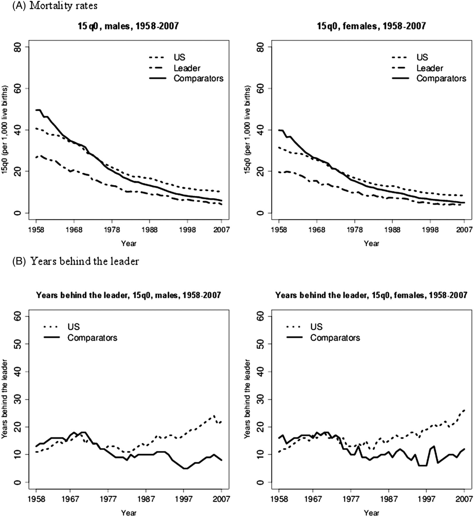
Evolution of mortality rates (A) and years behind the leader (B) in the 0–14 age group, for the leader, the USA, and the average of 16 comparator high-income countries, males and females, 1958–2007. Note: 15q0 is defined as the probability of dying from birth through age 14 at the then prevailing age-specific mortality rates.
Figure 4A shows the time trends for the probability of dying between age 15 and age 50 (35q15) for the leader, the USA and the comparators. See online supplementary tables A5 and A6 for values for 35q15 across countries. In a given year, the leader, the USA and the comparators had substantially higher mortality rates for men than for women. For both men and women, the US 35q15 was always higher than the comparators’ 35q15; the differential of 35q15 between the USA and the comparators, and between the USA and the leader stayed about the same from 1958 to 2007 for men. However, for women, the USA was slightly diverging from both the comparators and the leader from 1980 onwards.

Evolution of mortality rates (A) and years behind the leader (B) in the 15–49 age group, for the leader, the USA, and the average of sixteen comparator high-income countries, males and females, 1958–2007. Note: 35q15 is defined as the probability of dying from age 15 through age 49 at the then prevailing age-specific mortality rates.
Figures 3B and 4B show the number of years behind the leader that the USA and the comparators were for the 0–14 and 15–49 age groups, for men and women, over the 1958–2007 period. The number of years behind the comparators that the USA was, for the mortality rates in the 0–14 and 15–49 age groups, is also presented in online supplementary figures A3 and A4. Online supplementary figures A6 and A7 also report, for men and women, the gap in 15q0 and 35q15 between the USA and the comparators, and between the USA and the leader. For the 0–14 age group, up to the late 1970s, the USA and the comparators showed somewhat similar trajectories, between 10 and 20 years behind the leader (both men and women); on average, the USA was slightly ahead of the comparators then. Afterwards, while the comparators consistently kept pace about 10 years behind the leader, the USA saw an increase up to 15 years behind the comparators (see online supplementary figure A3) and up to between 20 and 30 years behind the leader through 2007 (both men and women). For the 15–49 age group, the USA was always behind the comparators over the whole period; the USA consistently diverged from the leader. The male trajectory, for the USA and the comparators, was similar until the early 1990s, when the comparators started converging on the leader, dropping from about 40 to 15 years behind the leader in 2007; meanwhile, the USA kept diverging with years behind the comparators increasing from about 10 years in 1990 to about 45 years in 2007 (see online supplementary figure A4), a corresponding increase in years behind the leader from about 45 years in 1990 to about 55 years. The female trajectory, for the USA and the comparators, was somewhat similar until the mid-1970s (20–25 years behind the leader then), when the comparators kept the distance behind the leader below 20 years (below 10 years behind the leader in 2007), while the USA continued diverging, being about 40 years behind the comparators and about 50 years behind the leader in 2007.
Discussion
This paper applies a sensitive measure of national performance—years behind—to comparison of US mortality rates with those of other high-income countries. As has been well documented,1 ,8 US life expectancy is lower and mortality rates are higher than in other high-income or comparator countries. Life expectancy results summarise and aggregate a heterogeneous combination of distinct age-specific mortality measures and patterns; hence, we further examined mortality rates across different age groups. Most strikingly, for both men and women, the typical high-income country had achieved, by the 1970s, a mortality rate in the age group 15–49 that the USA failed to achieve until about 2007: that is, the USA, in 2007, fell about 40 years behind the average (and 50 years behind the leader). A similar, if less pronounced, pattern appears for life expectancy and for mortality under age 15. The USA now lies far behind other high-income countries, but this was not always so. The detailed results of this paper allow for tracking the magnitude of US divergence and for (approximate) timing of when it began. Although our results contain noise, a key result emerges: sometime in the late 1970s, the USA stopped tracking its comparators and began to fall behind (table 1). At different rates for different indicators, the USA fell further and further behind over three subsequent decades. The finding is remarkably striking for US females.
Timing of US divergence from the average of 16 comparator high-income countries, for life expectancy, 15q0, and 35q15, males and females, 1958–2007
The analysis presents several strengths. It uses full life tables, for men and women, for 17 high-income countries for an extended time series, and allows for tracking the timing of US divergence. This provides a specific criterion for assessing the explanatory power of causes proposed for poor performance, and narrows the range of potentially important determinants. In particular, trends in mortality rates provide a starting point for assessing the importance of the determinants of health.9 ,10 The analysis also has limitations. For instance, it does not aim at fully explaining in detail why the US mortality gap emerged and grew, as it essentially proposes a tool for others making those assessments. In addition, while the results highlight a particular period in time when the USA fell behind other countries, one should be cautious in interpretation as there may be a lag time between any determinant change and its population-level effect on mortality. The timing of effects is delicate as different policies may have different temporal spans (eg, tobacco control). It may take a long time to reduce mortality gaps if appropriate interventions are not implemented rapidly. Some diseases may be amenable to both immediate curative and preventive interventions (eg, reduction of blood pressure), whereas certain habits/conditions independent of the current state of things, such as tobacco consumption11 and obesity,12 ,13 can affect mortality many decades later. Finally, the years behind results may be more stable when the comparator is the average of all the other countries rather than the leading country as there may be rapid changes in the leading country (see online supplementary tables A1–4). Hence, we also presented results for years behind the comparators (see online supplementary figures A1–4).
Concern for the poor US performance on mortality prompted major investigations by the US National Academy of Sciences1 ,8 into its nature (in terms of age groups and conditions) and its causes. Major potential causes that have been explored include cross-country differences in the level and equality of income, in the level of education, in social cohesion, in a broad range of specific risk factors, and in the level and quality of expenditures on the healthcare system. The National Research Council (NRC) examined the diverging trends in mortality between the USA and others with high income, looking at specific causes of deaths. NRC researchers estimated that a large part of the life expectancy difference was attributable to smoking, amounting to 80% and 40% of the difference for women and men, respectively.11 Less dramatically, they suggested that 20–33% of the life expectancy gap could be attributable to higher rates of obesity.12 They argued that smoking and obesity could well explain the rise in mortality recorded in adult men and women over the last decades.14 Other research has shown that chronically ill US patients tend to have less access to care, and benefit from less efficient and organised care, compared to counterparts in other high-income countries.15 Beyond substantial healthcare spending, social welfare spending is a strong determinant for population health.16 Overemphasising individual risk factors can obscure the importance of key determinants of health, such as financing and delivery.17 Constructively, these determinants offer the possibility that political commitment inside and outside the health sector can make real improvements in population health.16 ,17 Finally, the ‘compression’ of older age mortality from 1958–1967 to 1998–2007 in the USA may be attributable to the Medicare programme introduced in 1965.
It is not our purpose to reiterate the conclusions of the National Academies’ assessments. Rather, our conclusions point to an additional and quite specific criterion for judging the explanatory power of potential explanations for poor performance in the USA. Since we conclude divergence to have begun in the late 1970s, potential explanations like racial diversity, lack of health insurance and high income inequality in the USA become less plausible. Racial diversity and income inequality were high, and insurance coverage was low in the USA in the 1970s when the USA was performing well on health. Establishing a time for the beginning of the US divergence helps in identifying the effects of the broader social policy arena on health,18 and in narrowing the range of potentially important determinants and remedies.
Seeking potential explanations, we examined whether the more advantaged population groups presented similar trends to the average of comparator countries while looking at the maximum and minimum life expectancy (by county) and the average white and black life expectancy (by county) in the USA19 (see online supplementary figure A8). We found, however, that the maximum male/female and white male/female life expectancy followed a somewhat distinct trajectory in recent decades. Likewise, the divergence from the 1970s could be related to a lack of universal coverage with unequal treatment access and coverage at a time when many treatments for cardiovascular disease (CVD) (eg, antihypertensives and statins) became available. Using OECD data,20 we examined whether this divergence was following declines in CVD mortality. We found, on the contrary, that US CVD mortality reduced more rapidly in the late 1970s compared to comparator countries (see online supplementary figure A9). Recent research21 showed that, from 1983 to 1999, life expectancy declined significantly in 11 US counties for men and in 180 counties for women. These declines were caused by increased mortality from lung cancer, chronic obstructive pulmonary disease and diabetes, and were no longer compensated for by the CVD mortality decline.
Measuring health system performance will remain difficult: health outcomes depend on the health system together with non-medical, socioeconomic and geographical determinants, and can be affected by favourable risk factors. Assessing performance in health in terms of ‘years behind’ enables identification of trends and rapid changes in outcomes, for which researchers can then try to identify explanations. The years behind measure offers an intuitive and generalisable approach to measuring country performance in health, as well as convergent and divergent patterns, and can be readapted to various health indicators for diverse disease-related and condition-related outcomes. We suggest that this approach would also be valuable for the evaluation of US performance on specific causes of death and conditions, facilitating the design of policies that impact health and social risk factors for the most burdened populations.
Acknowledgments
This paper was prepared as a background document to a publication of the US National Academies and we received valuable comments on a draft from Laudy Aron of the Academies. We also thank Anna Peeters and Goodarz Danaei for their valuable and constructive contributions.
References
Supplementary materials
Supplementary Data
This web only file has been produced by the BMJ Publishing Group from an electronic file supplied by the author(s) and has not been edited for content.
Files in this Data Supplement:
- Data supplement 1 - Online appendix
Footnotes
-
Contributors SV and DTJ designed the study, conducted the analysis, interpreted the data and drafted the original manuscript.
-
Funding This work was supported by the Bill & Melinda Gates Foundation through the Disease Control Priorities Network grant to the University of Washington, and by the National Research Council of the US National Academies.
-
Competing interests None.
-
Provenance and peer review Not commissioned; externally peer reviewed.
-
Data sharing statement No additional data are available.